The Redemption of the Powder Room from Hell
Yes, the half bathroom just off our living room was THAT bad. When we moved in, it was clearly the one room of the house that the previous owner had bothered to "put a stamp on." I would have preferred that he left it boring builder grade. His "stamp" involved salmon colored walls, a humongous-for-the-space light fixture, a wall of red and gold small glass tiles framed out by trim (meant to be art?), a border of squares of the same glass tiles alternating with royal green tiles, a 3-D version of chair rail painted deep red, and a mirror framed out by the same chair rail, also pained deep red.
We quickly painted over the salmon walls to a coffee color, and painted the chair rail and mirror trim to bright white. But it. was. not. enough. We lived with it for almost five years, and then made our move. Here is what we started with, in March of this year:
An overview of the teeny space, in all it's glory (along with the child's potty we were too lazy to get rid of despite the fact that Lucy used it all of once)
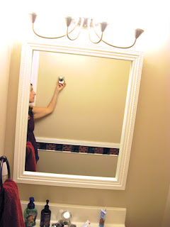
The overkill light fixture (this space does NOT need 4 light bulbs to make it glow), and my flabby underarm. Enjoy!
The wall of glass tiles
Up close and personal with the "decorative trim" that ran along two of the walls. Note that both the upper and lower wood trim used to be a dark red.
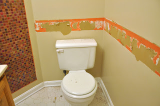
Finn managed to pull the upper layer of "chair rail" (seriously, this stuff was NOT meant to be chair rail, it stuck off of the wall about two inches) months ago, revealing vestiges of the salmon paint that used to be on the wall. Because it goes so well with green, red, and gold, obviously.
Another angle of the vanity, mirror, and light.
Note that I tried my best to work with the "red" overtones in the room (hand towel, kids' stool). Also, I took this photo because we had early hopes of replacing this builder grade, oak vanity with an off-white countertop and dated fixture. However, we have plumbing throughout the house that is no longer actually sold, so we decided not to mess around with pipes. That dream is dead, for now, though we may try our hand at staining the vanity a deep espresso color. Have any of you ever tried this? I found a good tutorial on Pinterest, but don't want to get myself into a "Pinterest Failure" situation.
OK, so it turns out that it is not so easy to get tile off of a wall, without actually ruining the wall. M. was able to get the tile that ran along the wall off while leaving the dry wall in "patchable" condition, but the "wall of tile" had to be cut out. This started M.'s first (but definitely not last) foray into hanging drywall. Made a bit harder because our car was not big enough to bring home a whole sheet, so he actually had to hand several small sections of dryway and do his best to cover the seems. Here are some "during" photos:
M. was able to cover most of this with mud and tape, just had to use a couple of couple of patches for the deeper areas.
Another nice, fun thing we found out was that the existing light fixture was installed directly into the drywall. Meaning, there was no electrical box. Just wires coming out of the wall. I thought this was something peculiar to the half bathroom that was the fault of the prior owner, but it turns out that NONE of the bathroom vanity lights have electrical boxes. We know this, because we are in the process of replacing the vanity lights in the master bathroom, both of which were ALSO wired without electrical boxes. For the half bath remodel, M. did it the "hard way," and made a bigger hole in the dry wall so he could attach an electical box to a stud. He then had to put up a segment of dry wall, tape it, mud it, sand it, mud it, sand it... you get the picture. What a pain in the ass! And the previous owner SAW that there was no electrical box when he removed the builder grade light fixture, IGNORED this fact, and then installed his own ugly, heavy light fixture. I'm surprised we all never burned up in our beds. Note that for the master bathroom, M. has discovered that there is something called a "remodel box," or something like that, which lets you add an electrical box without screwing it in to the nearest stud. We are trying that now, with hope that it will save a couple of those "mud it, sand it, mud it, sand it" steps.
All in all, this "light" remodel took 4-5 weekends to complete, mainly because we weren't motivated to work on it every day. Once the initial demo was done, and the drywall screwed in, it was relatively easy to do a round of sanding and mudding every night (says the person who did none of it). But since it was M.'s first time around, he did more rounds of mudding than usual - and still didin't get the walls "perfect" (though if you ask me, it is 5 millions times better than what we had before, and thus perfect). I didn't help with much of the process - I lent my arms when it came time to (finally) hang the new light fixture, and I helped paint a little. However, the bathroom was finished up just before Lucy's birthday party, and I had my hands full baking a cake. My role came in when it was time to pick the wall paint, and decorate. I chose (as I mentioned previously) a "trendy-but-hopefully-timeless?" color scheme of grey and yellow, and went from there. I put off writing this post because of my inability to find a picture to put up over the toilet. We managed to stumble on the perfect thing at Home Goods just a few weeks ago, and now I can finally post "After" photos in comfort:
A peek in from the hallway. I don't know why the outer walls look purple, they are not purple.
Same vanity, new handtowel. And hand soap. That shit's important, yo!
New, two-light vanity fixture and smaller mirror.
The "wall of tile" is gone! And has been replaced by wee little yellow trinkets and postcards from Maine (because we want to live! in! Maine! one day!)
I decided I HAD to have cactuses for this space. Turns out cactuses do best in sunny areas. Oh well. This room has no windows. So instead, this one cactus has had to survive by growing itself AS TALL AS POSSIBLE. It used to be on the lower shelf, but I was afraid it would run out of room, so I had to move it to the upper shelf. Also pictured: bird candle (I am solidly on the bird trend bandwagon), tile from Kuwait, random glass bottle with cork stopper).
The "decorative shelves" and accompanying picture-that-was-so-hard-to-find:
Yellow! And a bird sketch!! It was like a divine intervention.


Wow, what an improvement! I love yellow and gray. And it is so subtle and tasteful and not red, green, and orange, hooray!
ReplyDeleteWe also want to live in Maine and have an enormous nautical chart hanging in our living room.
If you want to live in Maine you first have to find jobs which means you have to start looking sooner than later. And that would make your father and I very very happy
ReplyDeleteAwesome!! You did a great job!!
ReplyDeleteHuge improvement! Put a bird on it. Absolutely.
ReplyDelete